Brand Scalability
System thinking
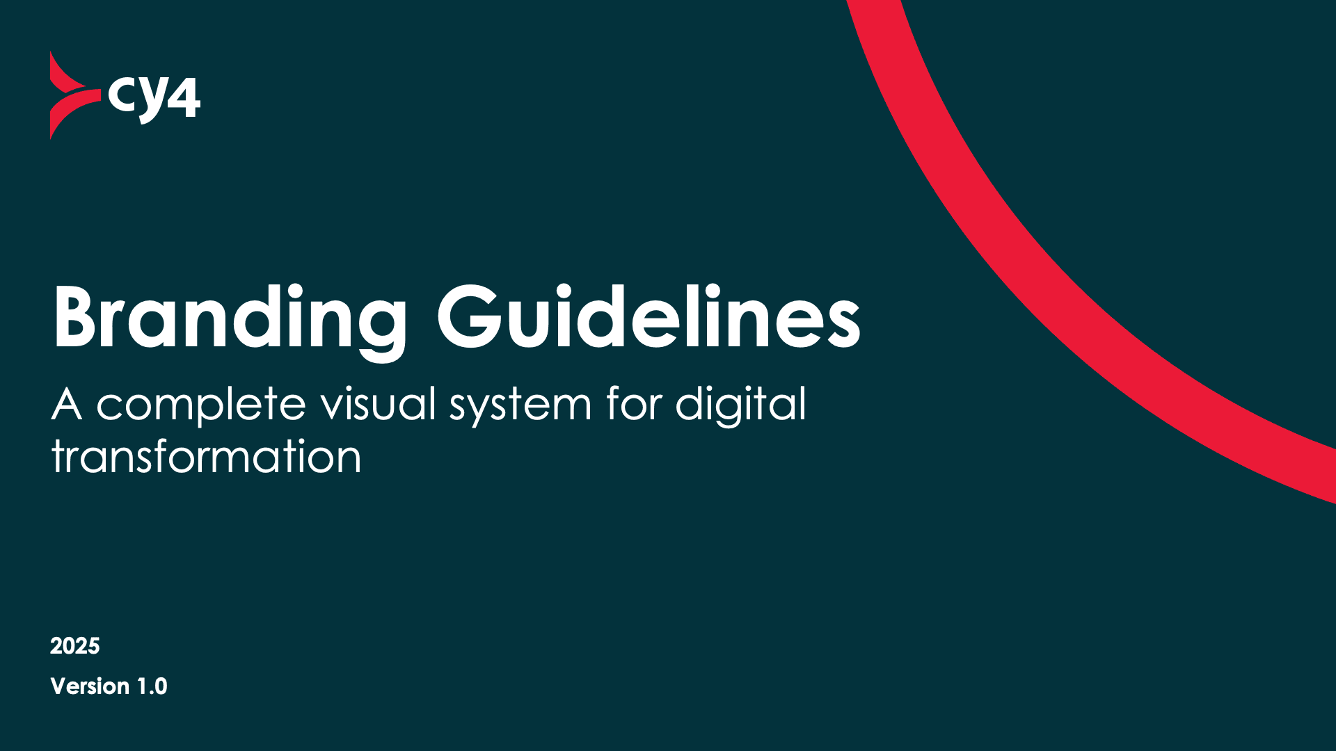
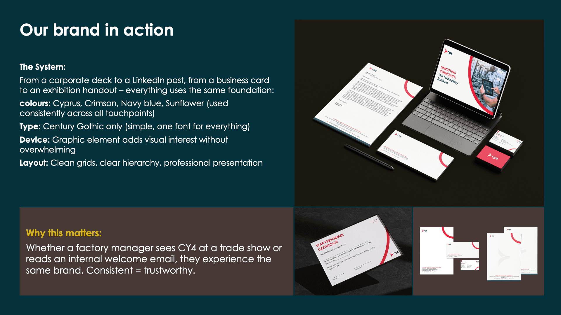
A Visual System for Digital Transformation
Role: Brand Strategy, Visual System Design & Template Production
Client: CY4 Digital Twin Products & Solutions Pvt. Ltd.
Key Impact: Delivered 26-slide brand book + 18 editable templates adopted by a team of 50+

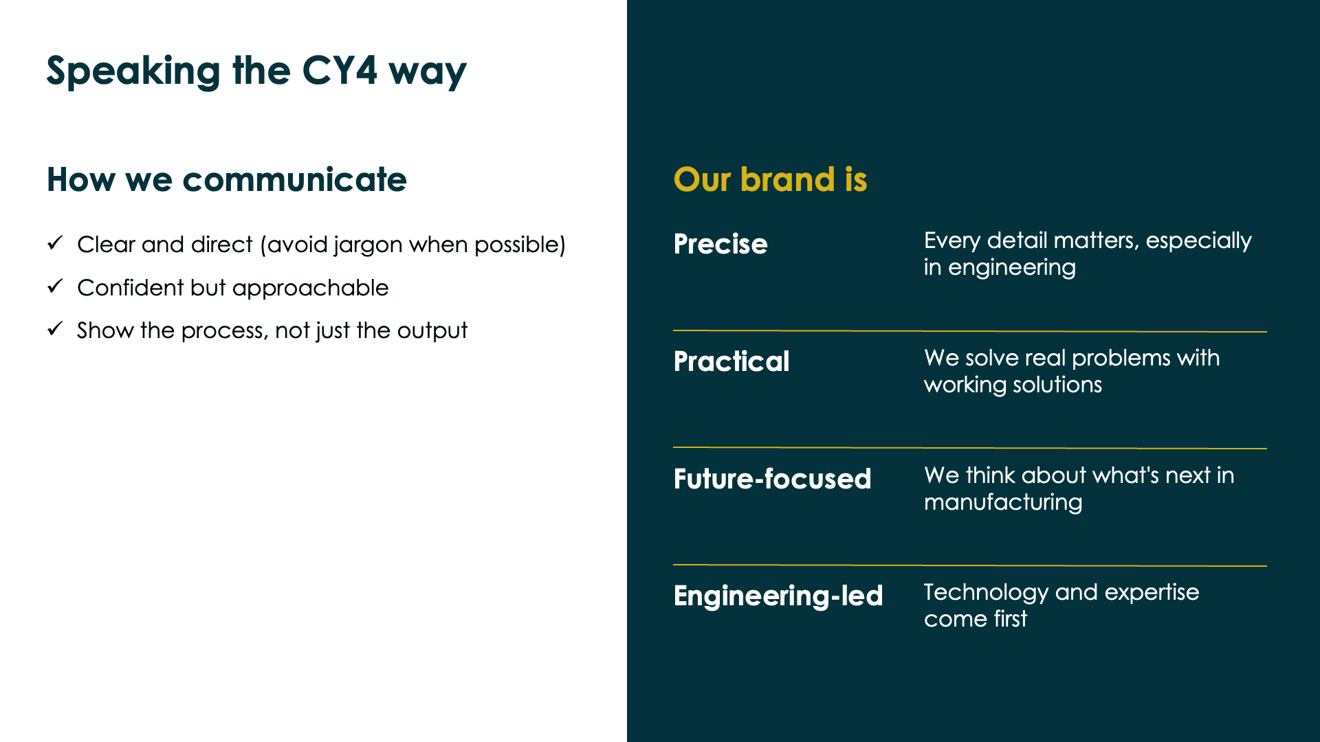
My Goal
I worked with CY4 to create a clear, consistent visual identity that could be applied across their corporate documents, events, digital and internal communication.
Approach
1
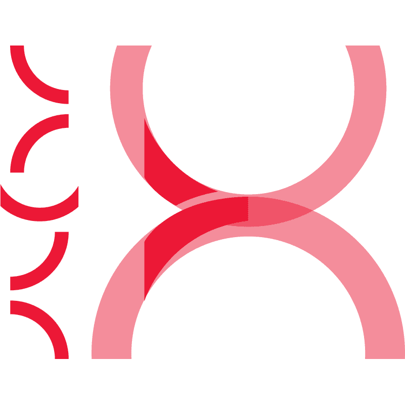
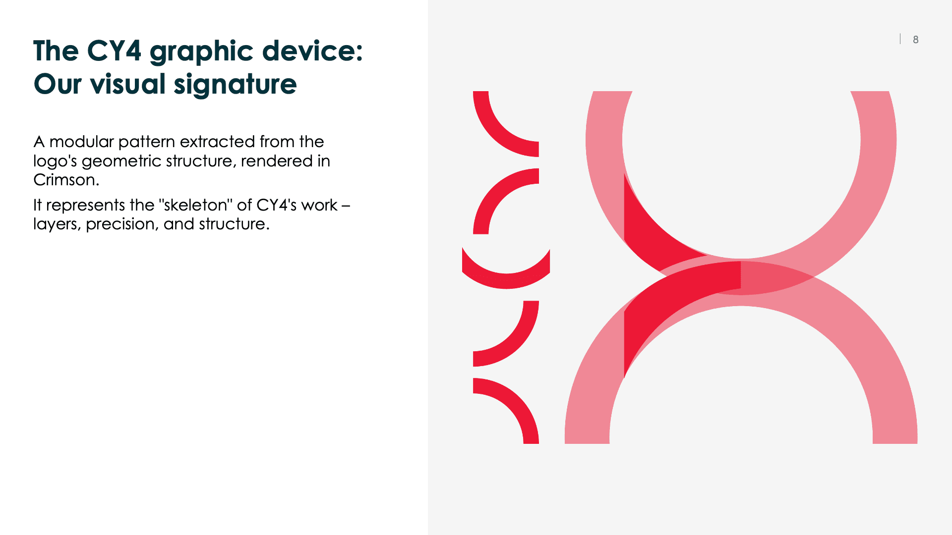
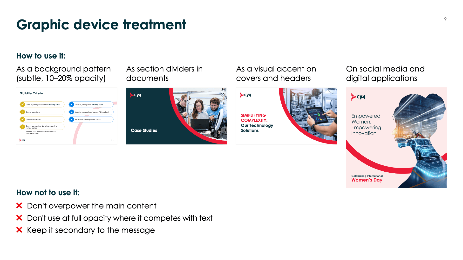
The Graphic Device: Visualising "Structure"
I built a language from the existing logo. I took the geometric angles from the logo – which look like structural beams or digital nodes – and turned them into a pattern.
Why? This pattern represents the "skeleton" of a factory or a 3D model. It allowed us to brand a document or a slide instantly without just pasting the logo in the corner.
2
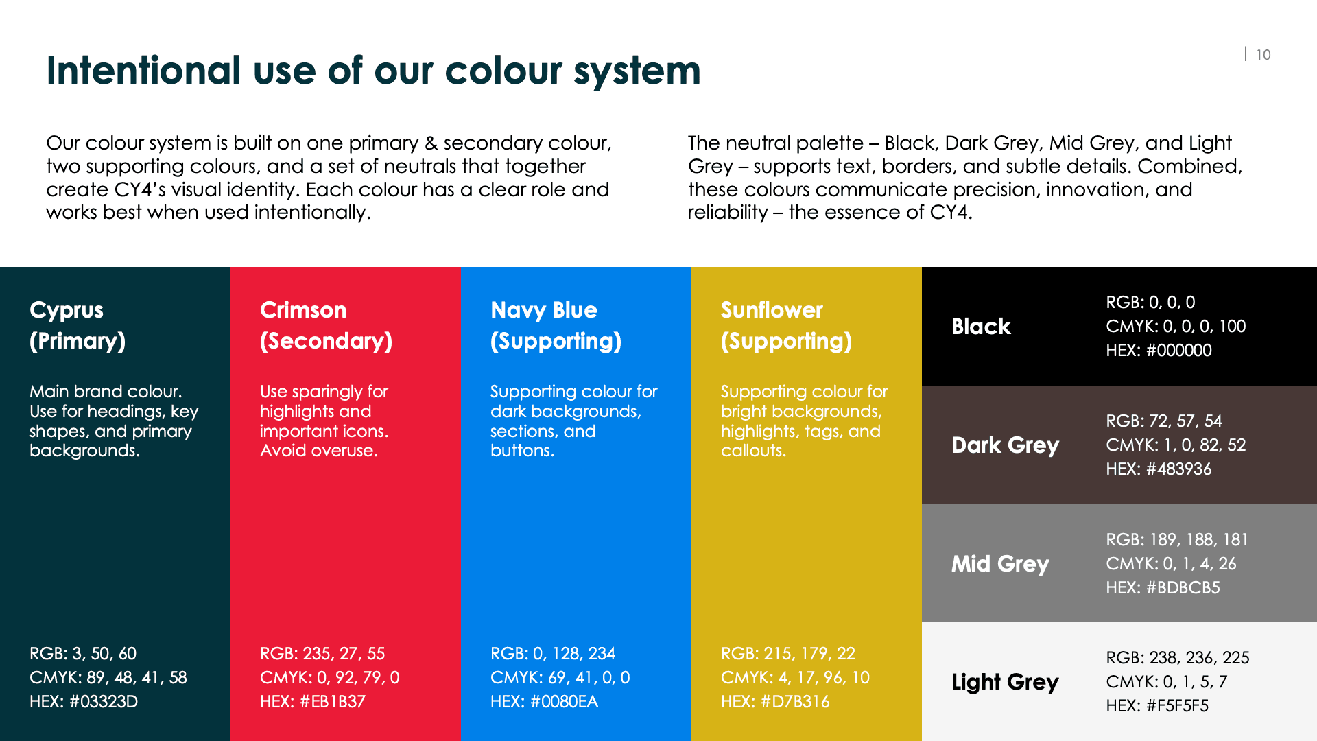
The Colour Strategy
Their original palette relied heavily on Crimson (Red) and Cyprus (Dark Green).
The Problem: In manufacturing dashboards (which CY4 builds), red usually means "Line Stopped" or "Danger." Using it everywhere felt wrong for an efficiency company.
The Fix: I reduced the red to a highlight color. I introduced Navy Blue to represent corporate trust and Sunflower Yellow to add energy. Now, the brand looks like a modern tech partner, not a warning sign.
#03323D
Cyprus
#EB1B37
Crimson
#0080EA
Navy blue
#D7B416
Sunflower
3
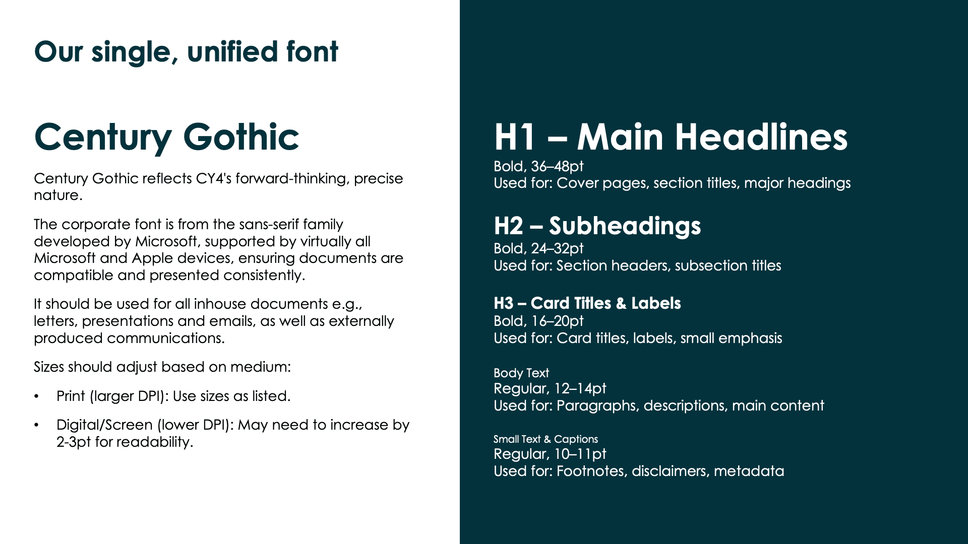
Typography
I selected Century Gothic.
It’s geometric and clean, which matches the precision of engineering drawings.
Practicality was key here: it’s a standard font available on most computers, so their engineers and sales team could create decks without formatting errors.
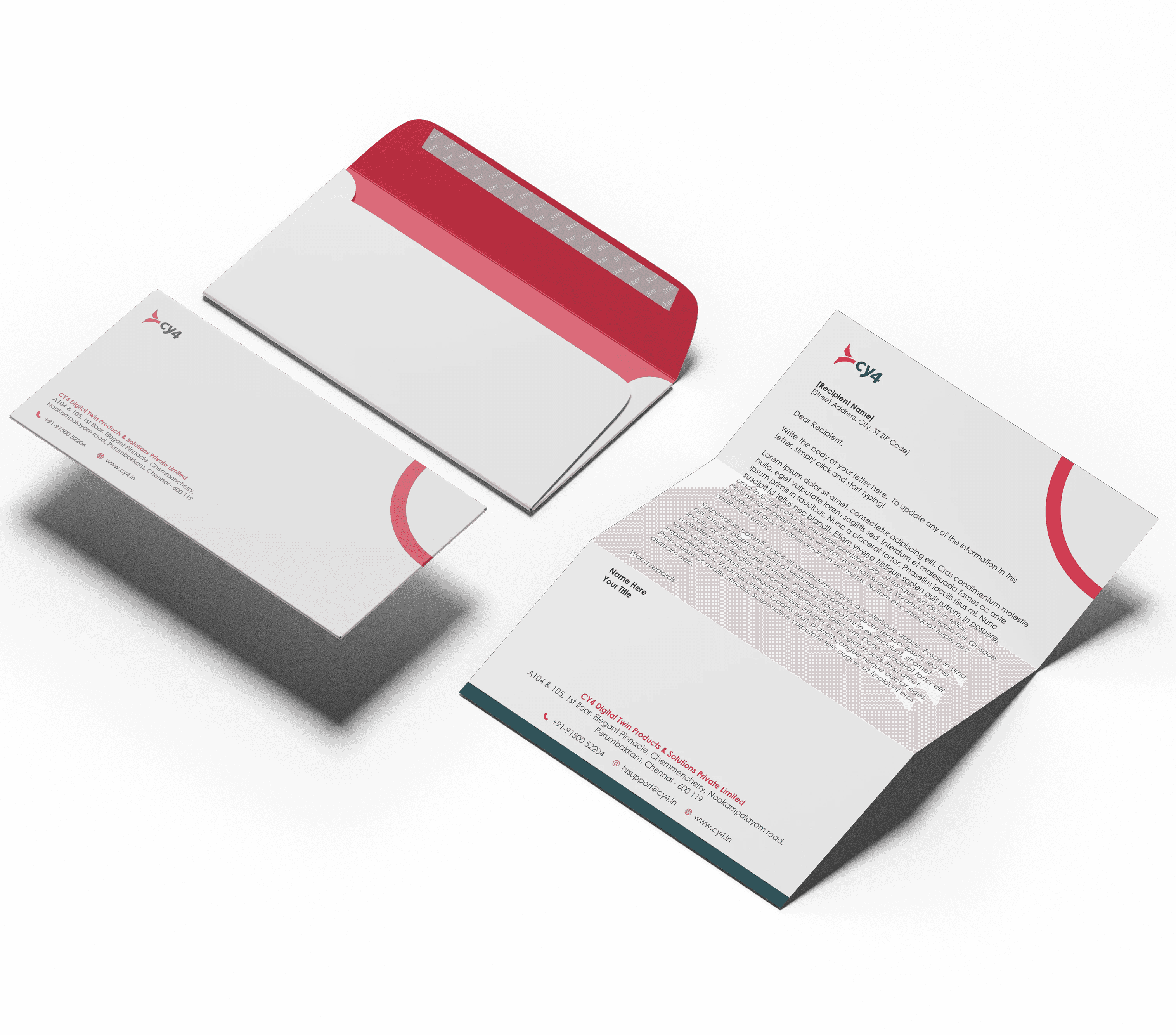
Deliverables
1. For Scalability & Consistency
I created a complete brand book that documents all the rules – logo usage, color codes, typography, and how to apply them across different materials.

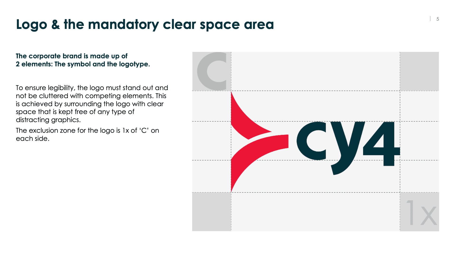
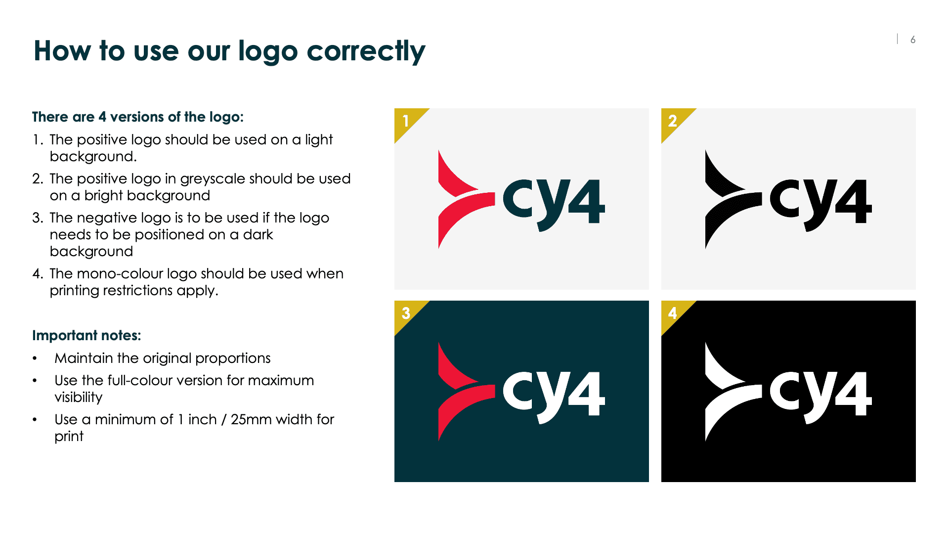
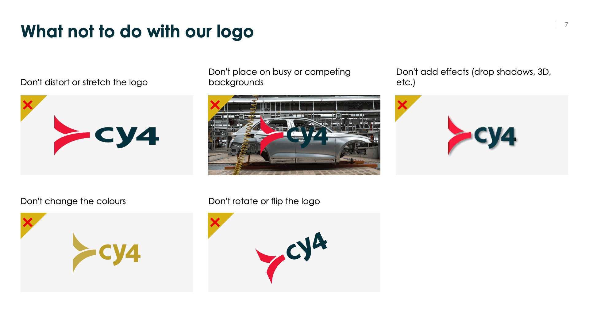
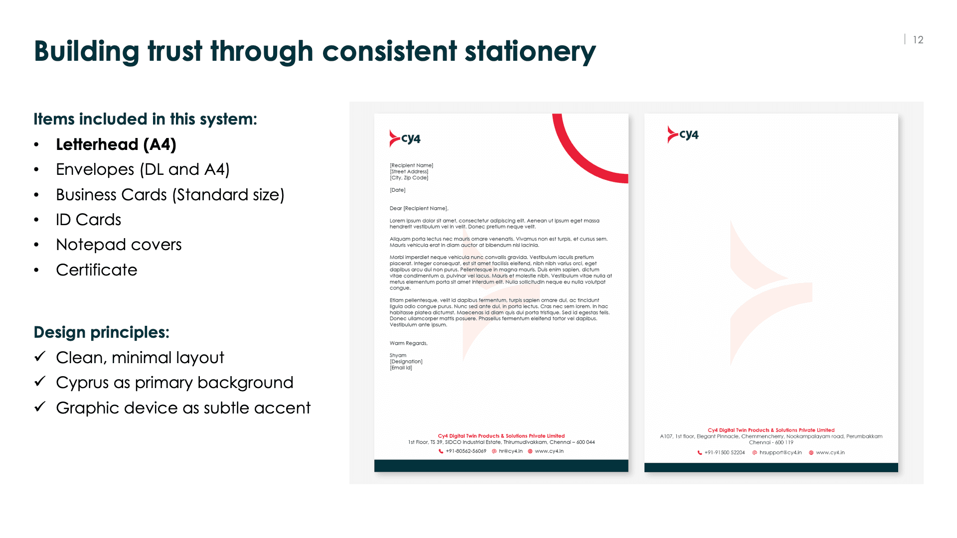
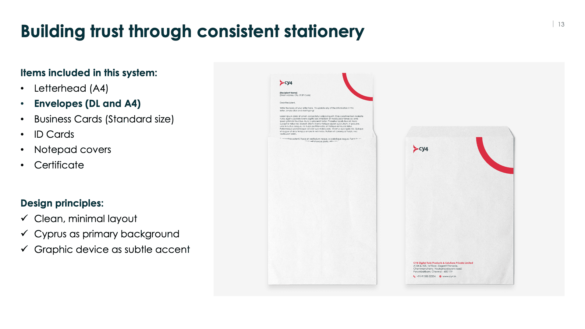

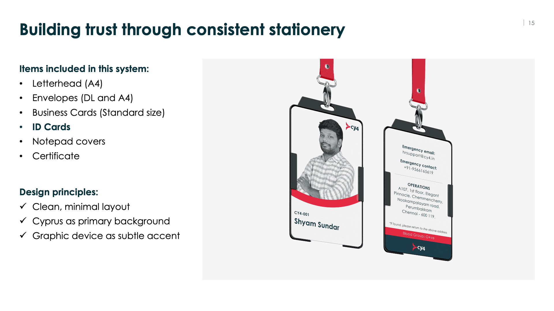
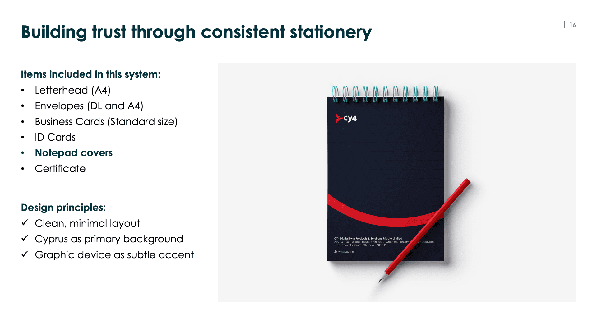


This brand book is focused, practical, and easy to follow. Perfect for a startup team that needs clear rules without complexity.
2. For Corporate Website
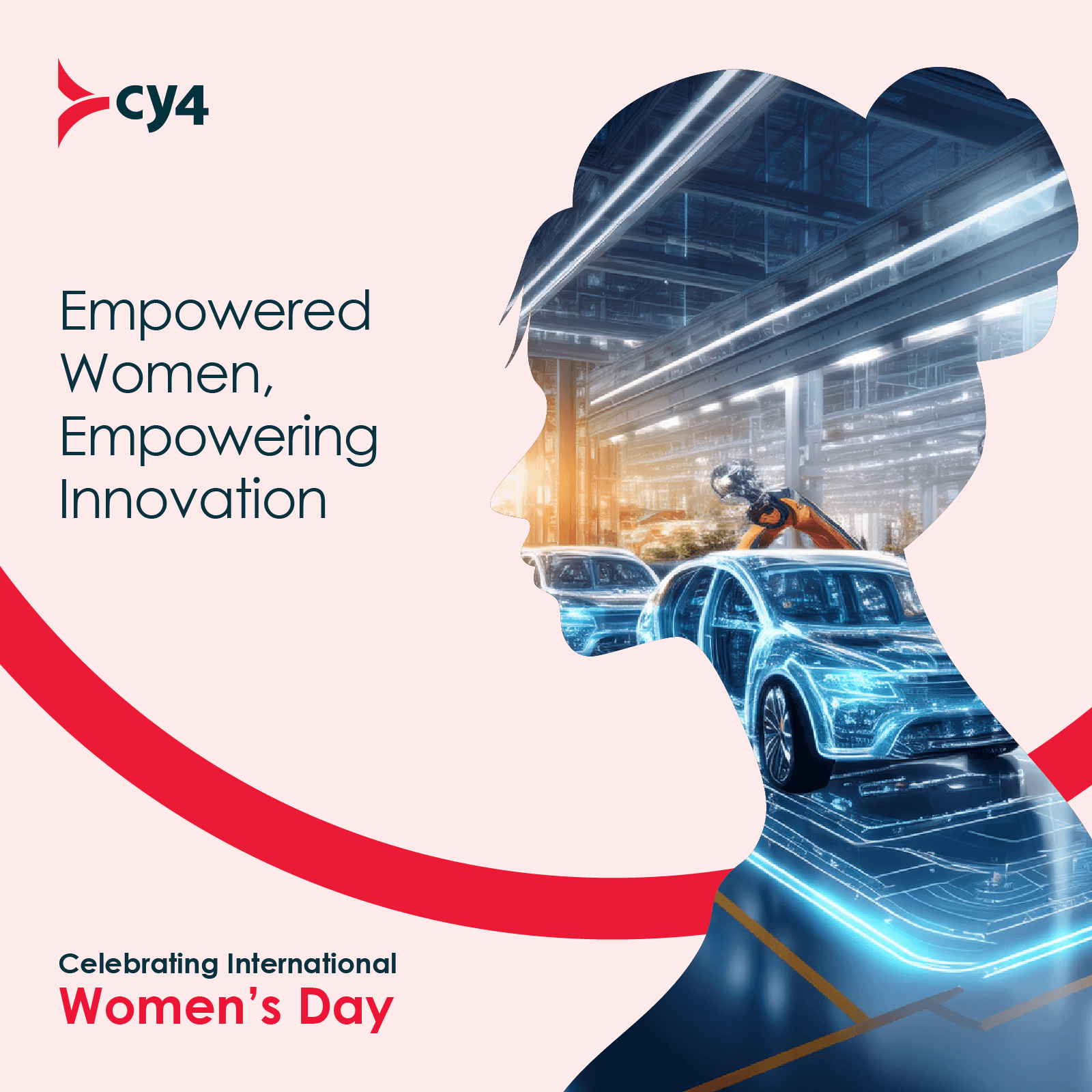
I extended the CY4 visual system into the corporate website to create a consistent digital presence for prospective clients and partners. The site applied the same typography, colour hierarchy, product framing, and visual language established in the broader brand system.
Connect CMS Image fields (Image 1–10)
The homepage introduced the brand in a more structured and credible way, while the product pages used a repeatable layout to present BuildIQ, FlowIQ, and DevIQ with clarity and consistency.
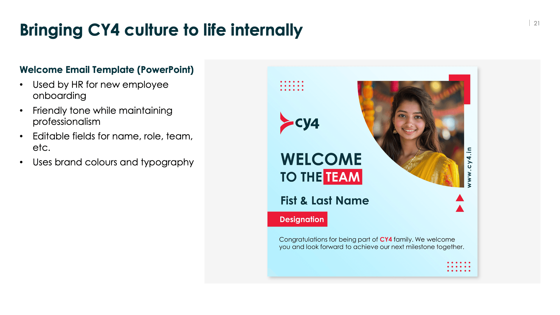
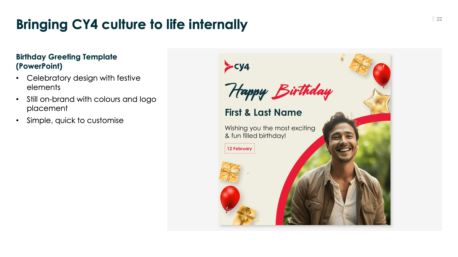
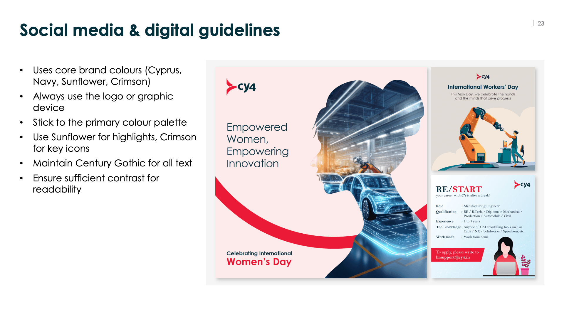
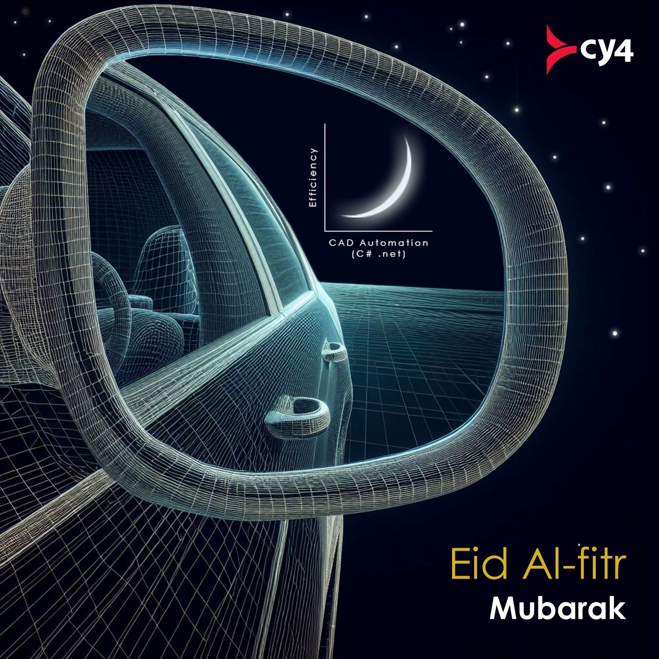
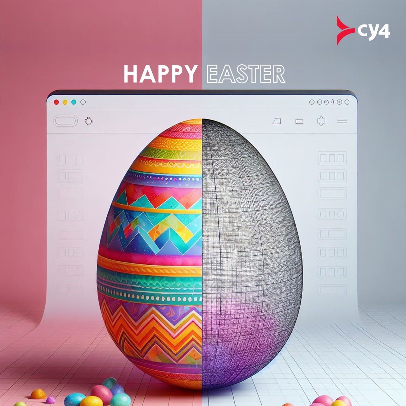
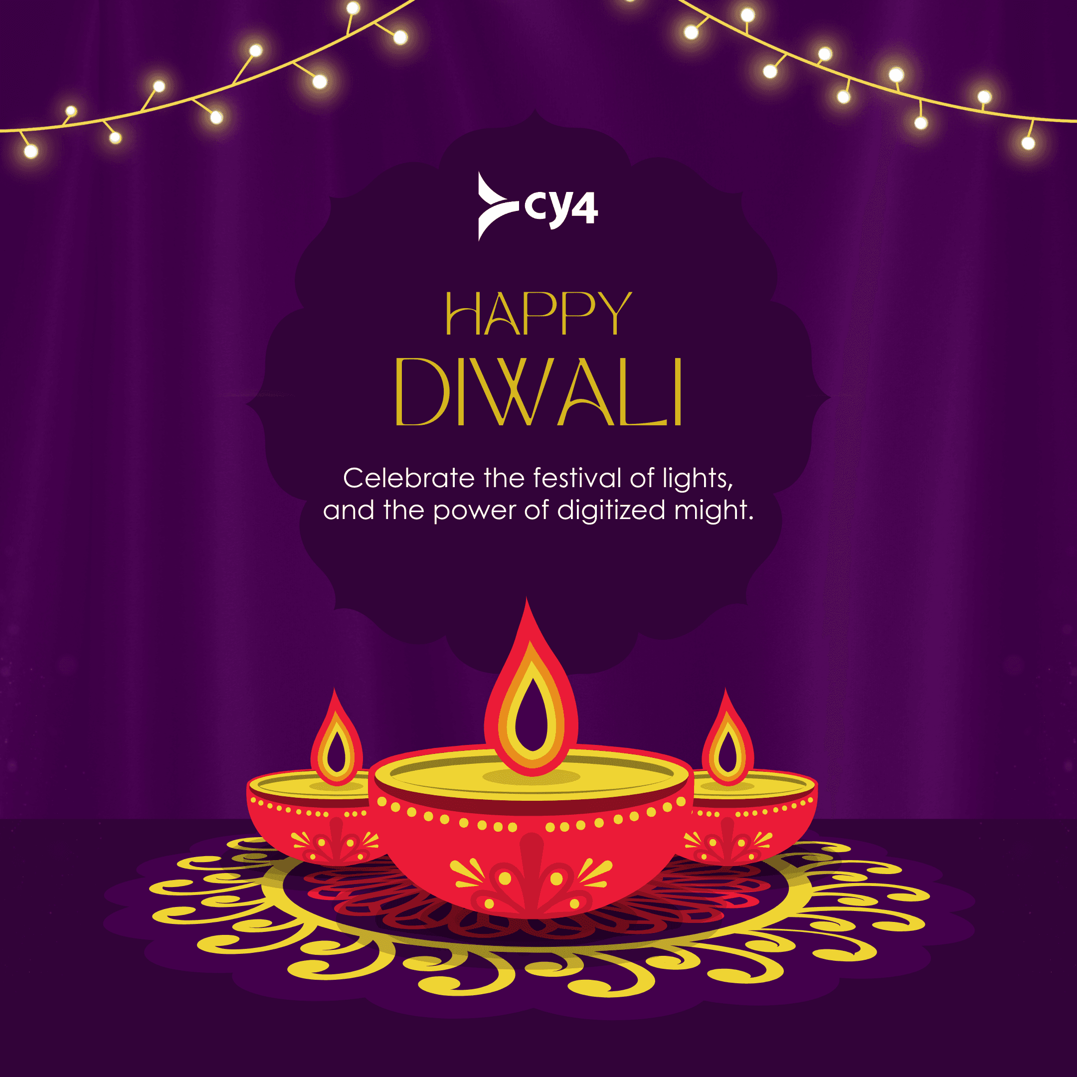
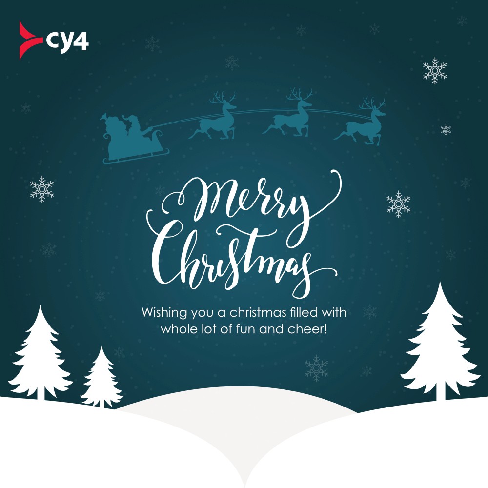
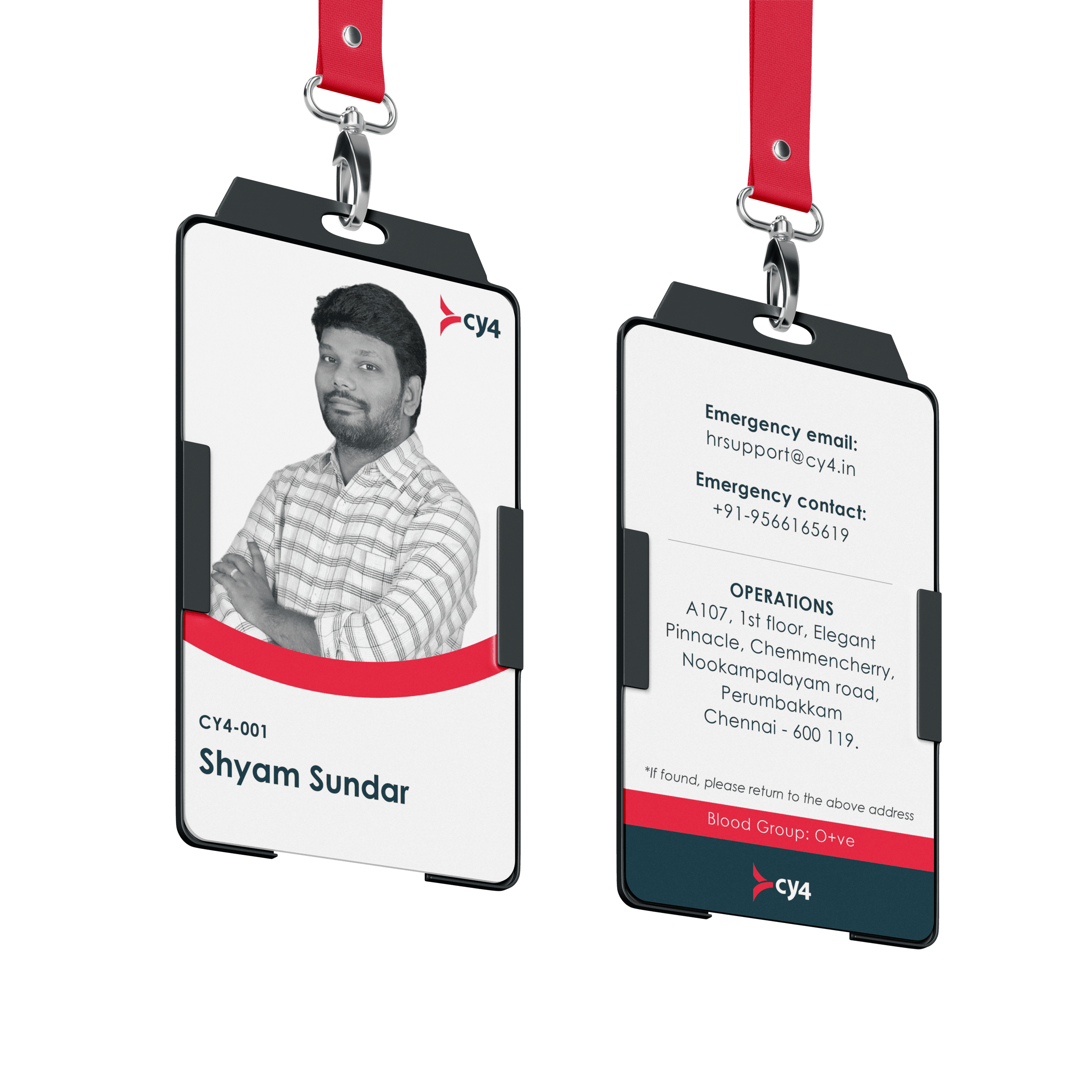
3. For Internal Culture
CY4 has a diverse team with varied expertise. These editable templates allowed everyone to work in the tool they were already familiar with – PowerPoint, while still staying on brand.
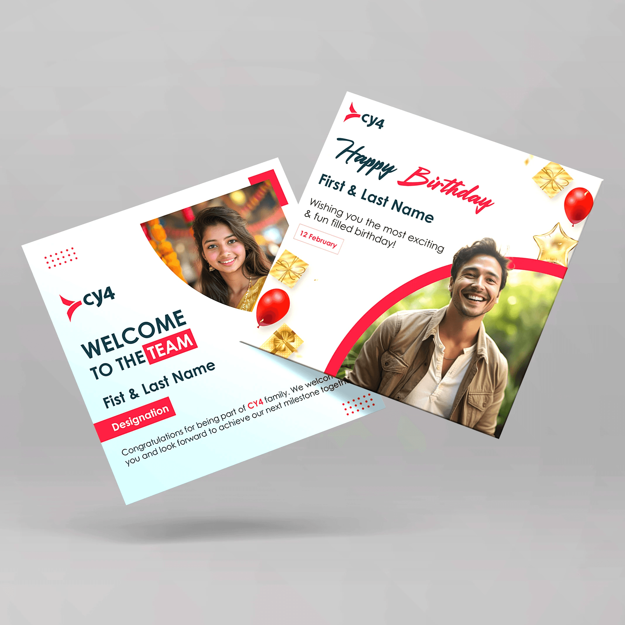
Internal branding toolkit
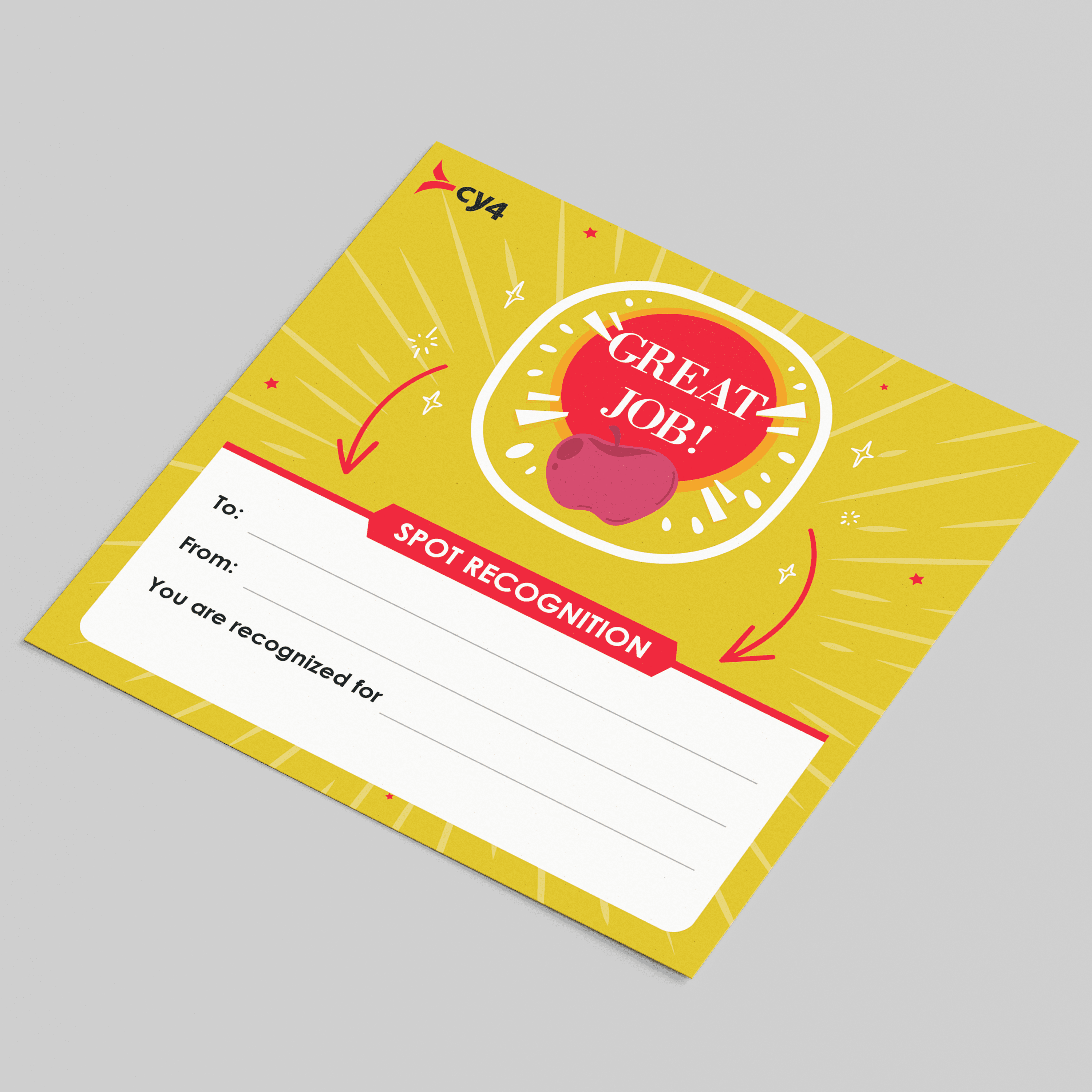
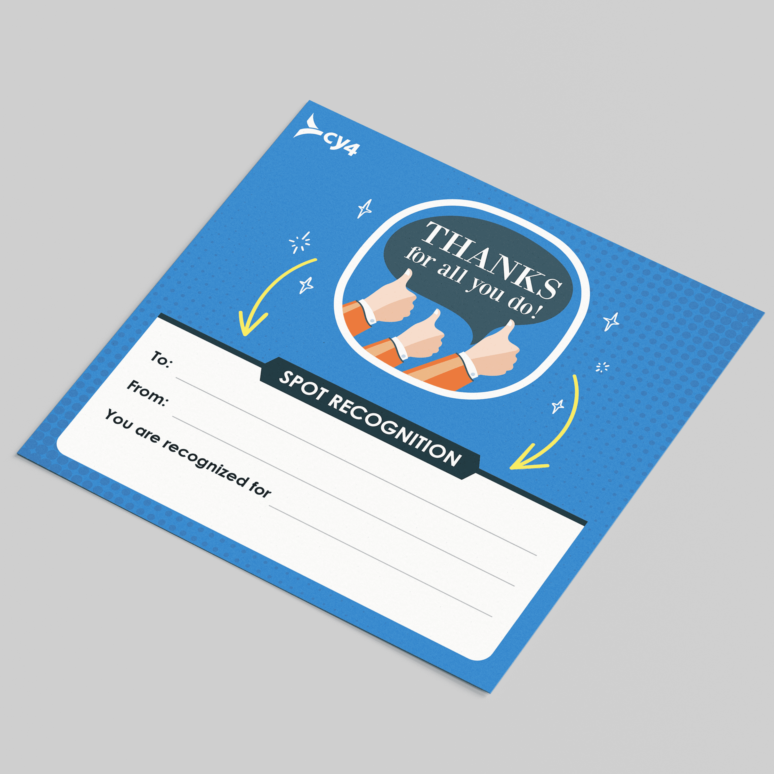
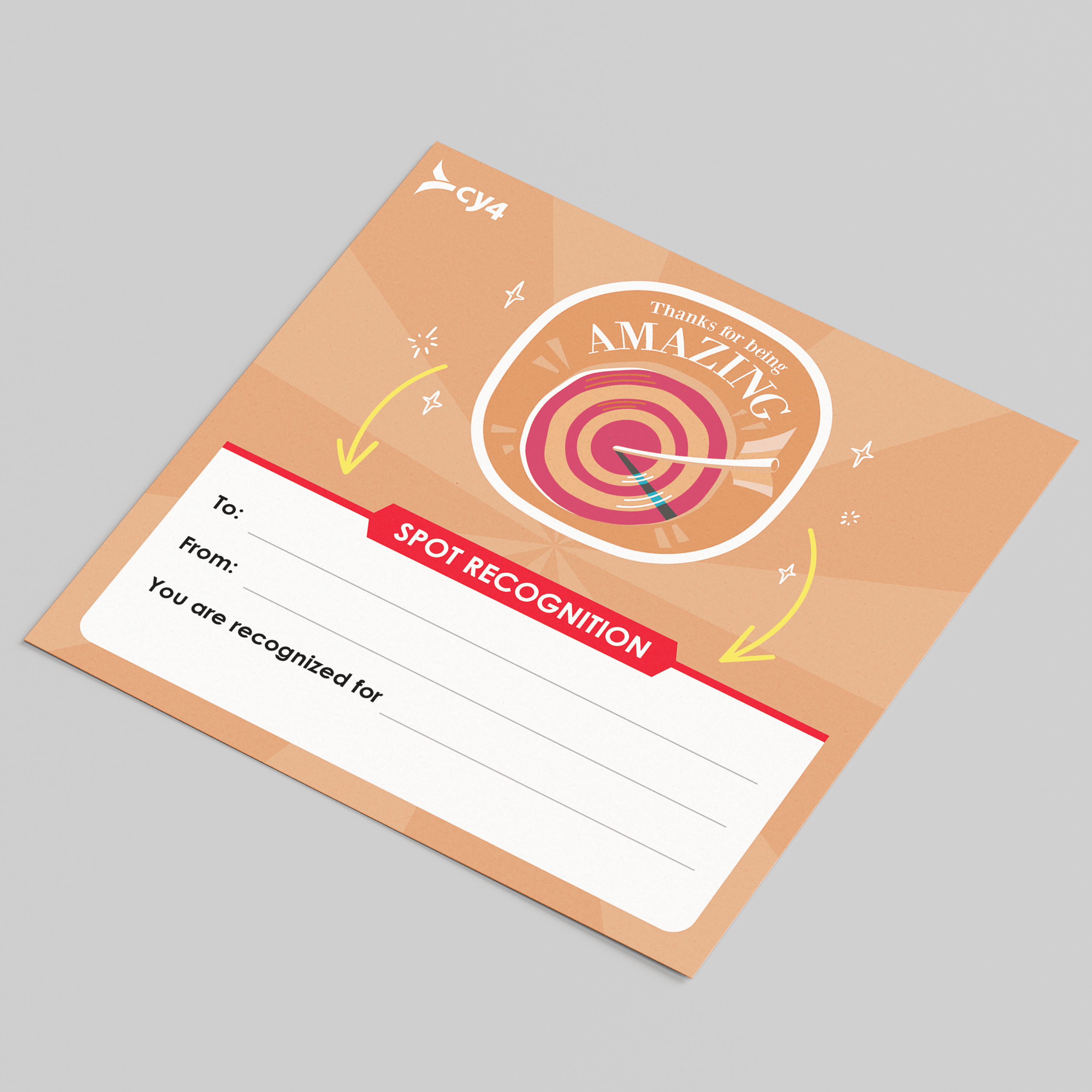
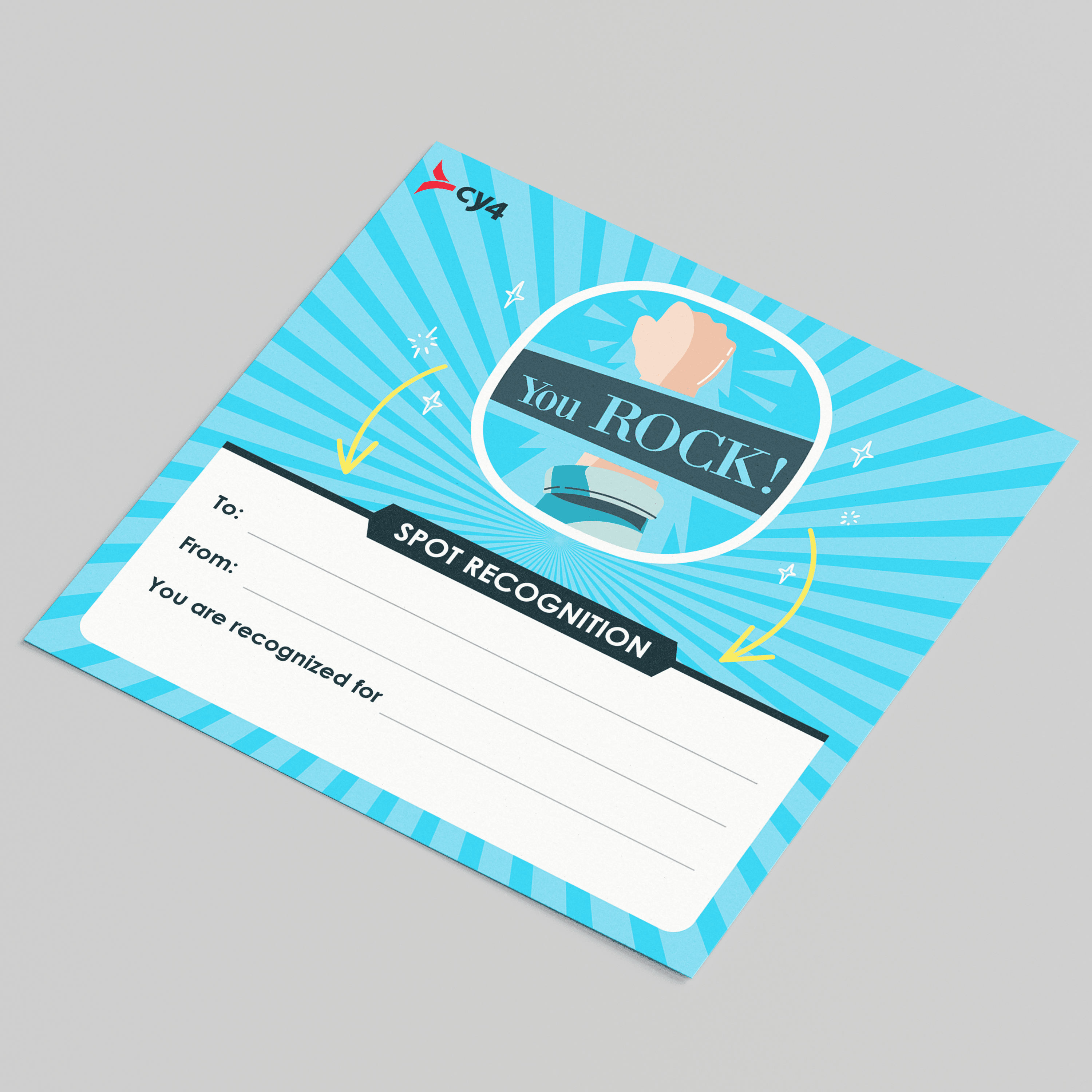
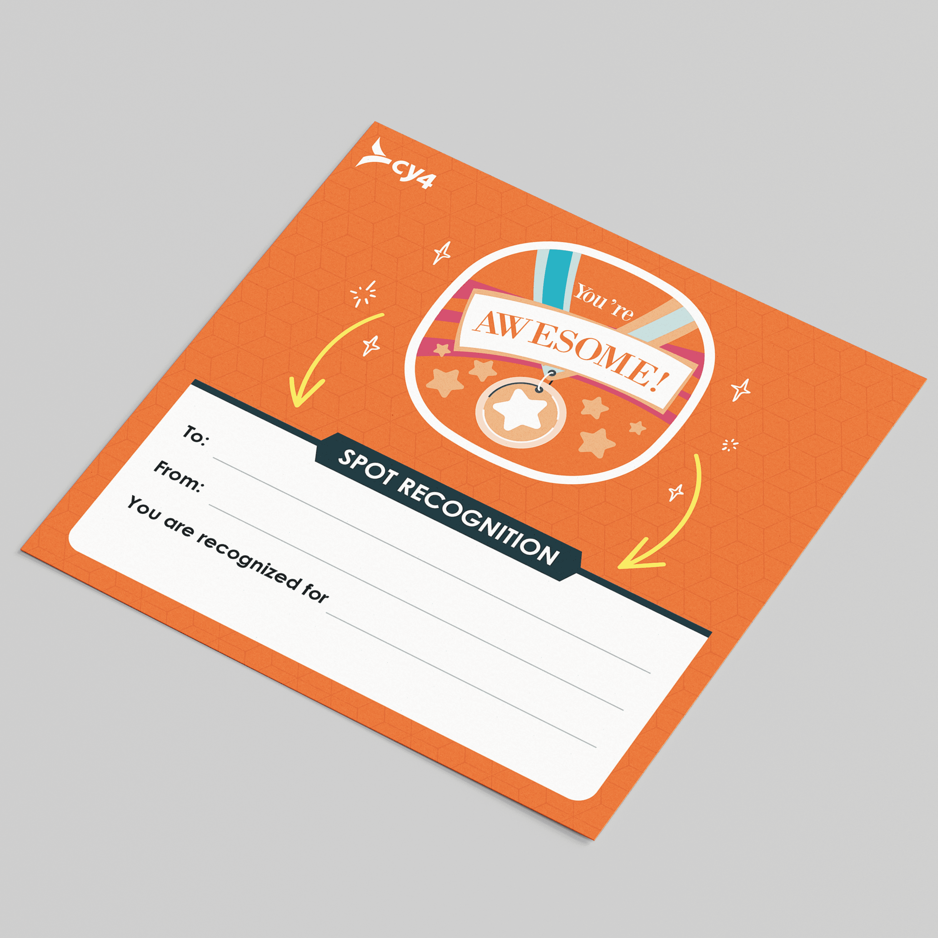
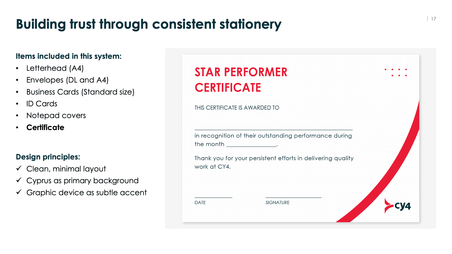
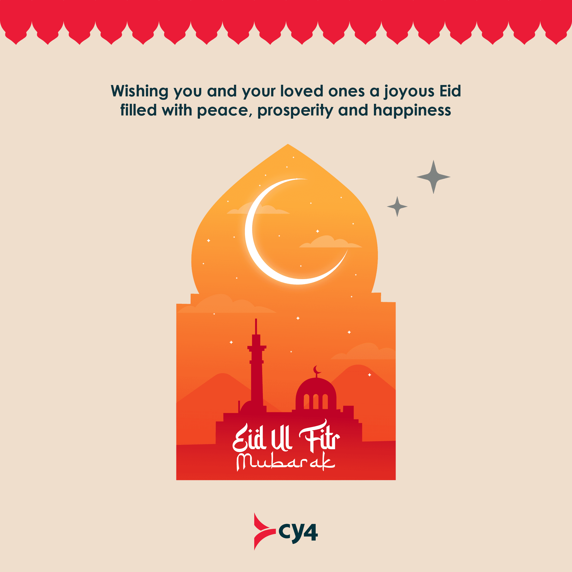
Spot Cards
I designed retro-style recognition cards for employees. These were fun and broke the strict corporate look, giving the team a human way to recognise colleagues.
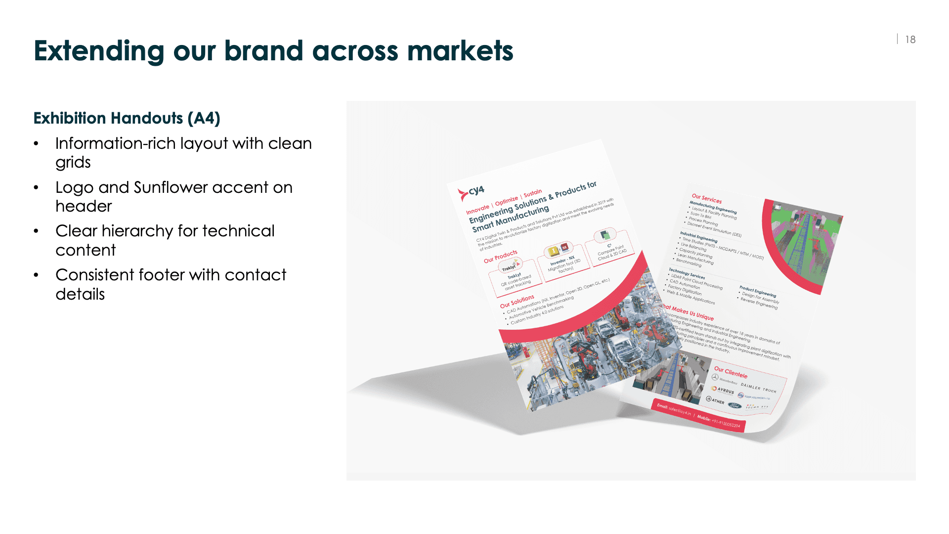
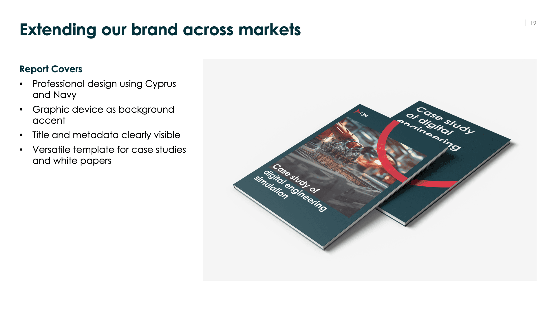
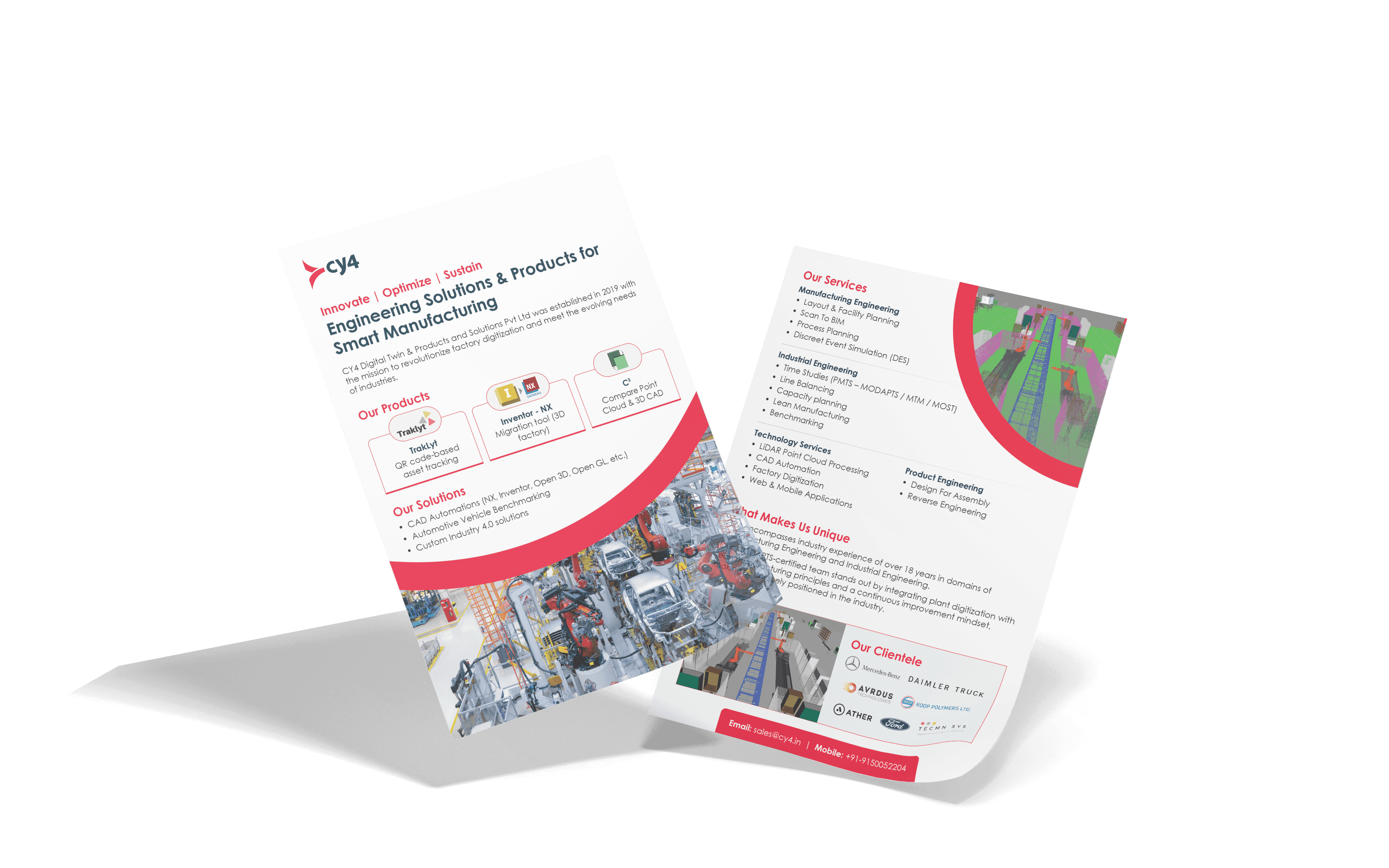
4. For B2B Sales & Exhibitions
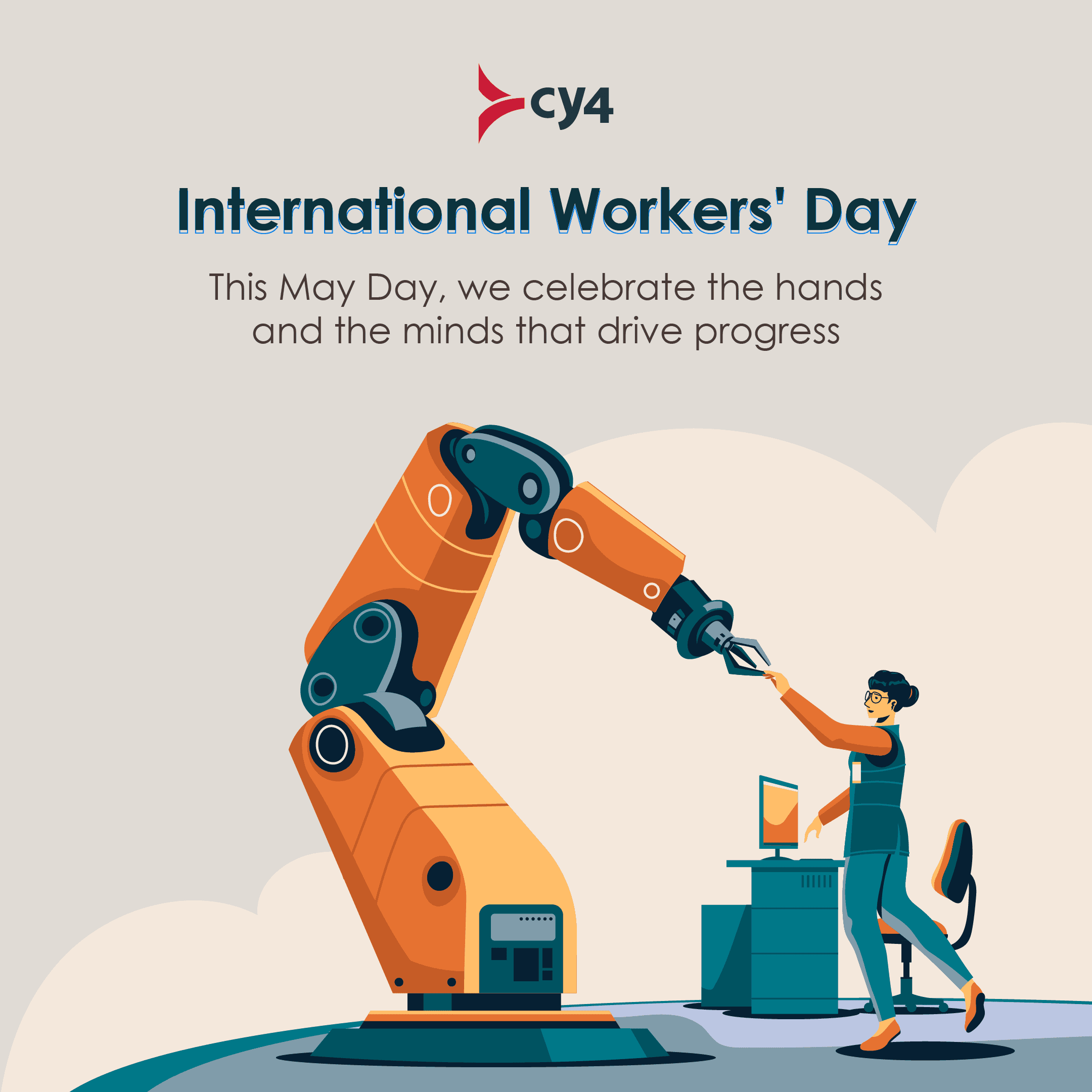
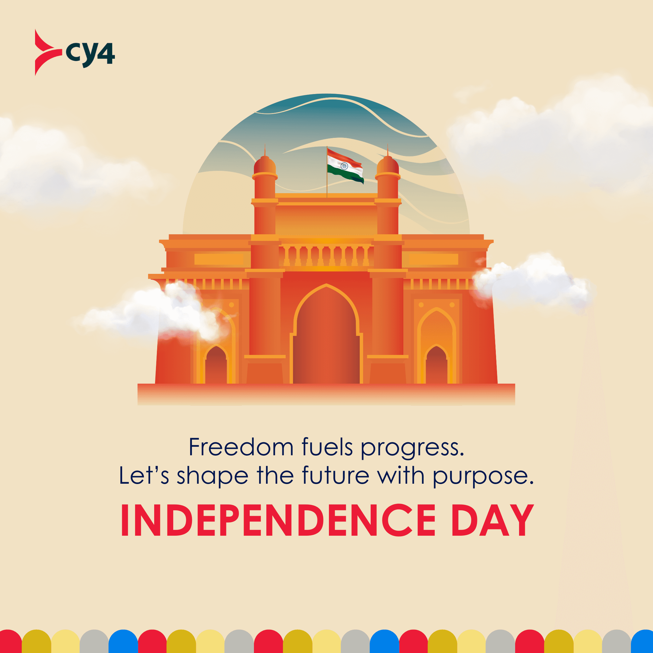
I designed exhibition handouts, report covers, and a refreshed corporate deck using the same grid, color, and type system.
Connect CMS Image fields (Image 1–10)
This made technical content easier to read and helped CY4 present a consistent, professional story whether they were at a trade show or in a boardroom.


The Outcome
This branding didn't just make CY4 "look better." It gave them a functional system.
Sales
The sales team had professional templates for client proposals.
Consistency
From a "Traklyt" product flyer to a "Digital Factory" service report, everything clearly came from the same company.
Culture
The internal team had a brand they were proud to wear and share.